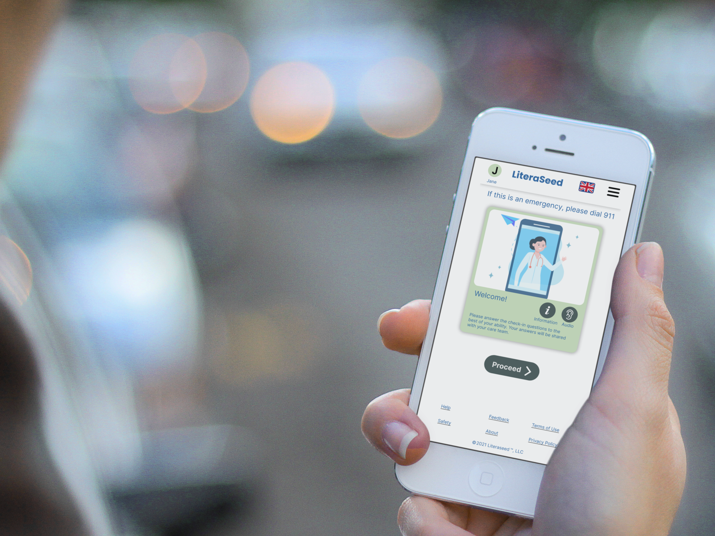
An accessible app to eliminate communication gaps between patients and doctors.
“One in five adults with Low English Proficiency (LEP) report negative experiences with a provider, one in eight report being treated unfairly or with disrespect, and about half report practicing vigilant behaviors associated with healthcare visits.”
Gonzalez-Barrera, et. al.
Project Overview
Role
UX Researcher & Designer
Duration
2 Weeks
Scope
Researching, Designing, Testing, Prototyping
Design Team
Adam, Kim, Sukanya
Who’s the Client?
LiteraSeed is a browser-based application that helps people communicate their medical symptoms to their doctors.
LiteraSeed was founded after one of the co-founders’ young cousin tragically passed away due to language-based miscommunication.
What do they need?
LiteraSeed needs an app that lets low-literacy patients input their symptoms easily and accurately. The app requires accommodations for users with cultural differences and communication challenges. While a basic version of the app has been built out, the experience is often frustrating, unappealing, and difficult to navigate.
OB/ GYN Questionnaire
Use Case: A link to the questionnaire will be sent to a patient before their appointment. Users will finish it before their doctor’s appointment.
Meeting the Users
Documentation provided
Our clients generously gave us notes from previous usability tests involving refugees with low English literacy. These reports were instrumental in our analysis.
Analysis through affinity mapping
We utilized affinity mapping to synthesize the information from these usability walkthroughs. This process allowed us to identify recurring patterns and key insights.
Key insights
While the users appreciated having the survey as a structured means of communicating with their doctors, they also found it insufficient in some areas.
The survey served as a useful framework, but it often fell short of addressing the specific points that patients wished to convey. This highlighted the need for improvements to make the survey more comprehensive and aligned with the users' communication needs.
Findings from User Interviews
During our interviews, a consistent theme emerged: all three participants were knowledgeable about medical terminology in their native languages but had significant difficulties with those terms in English, leading to frustration.
Interview Methodology
We conducted interviews with three recent refugees using WhatsApp audio calls to accommodate their preferred communication method.
User Demographics
LiteraSeed's user base is diverse, including refugees, non-native English speakers, individuals with low digital and language literacy, the elderly, and people with disabilities. This diversity highlighted the need for an accessible and user-friendly interface.
Cultural Understanding
An example of a communication breakdown was provided by one of our users. This user informed the interpreter that he believed he had jiggers (fleas). However, the interpreter's notes recorded it as chiggers (a mite). Although seemingly a minor difference, the implications are significant.
Jiggers are fleas that burrow under the skin and require prompt medical attention, whereas chiggers are almost harmless. One can only imagine what the doctor’s diagnosis and prescription was.
“Jiggers” are fleas that burrow under the victim’s skin and require immediate care while “chiggers” are harmless.
Identifying Pain Points
Given the vast scope of potential user research spanning diverse cultures, subcultures, languages, and regions, we identified three key points to narrow our focus. This approach allowed us to concentrate on actionable objectives for this sprint and ensure our efforts were both targeted and effective.
Persona
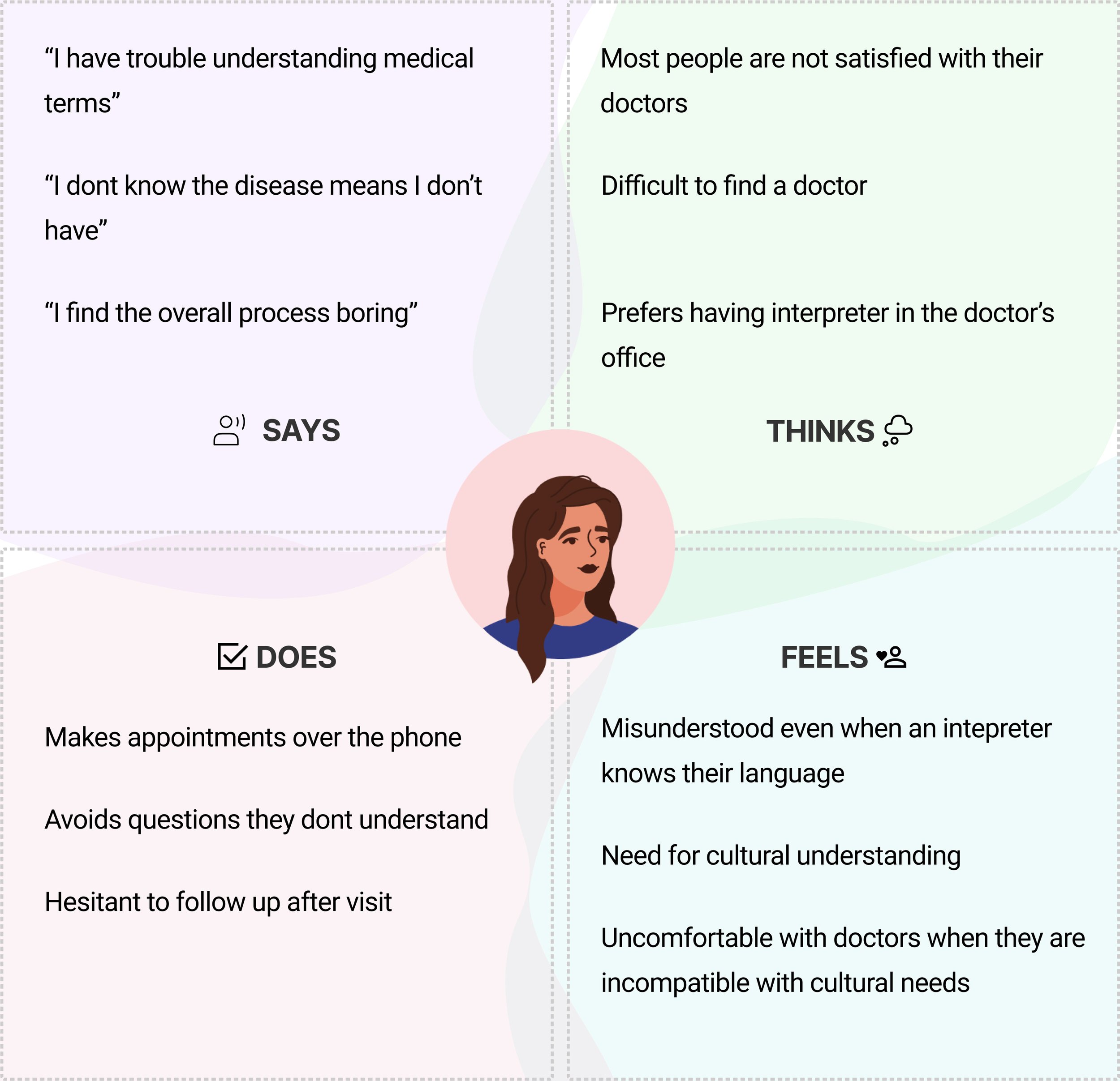
To contextualize these pain points, we developed a persona for this sprint. Our persona is a woman in her 30s who speaks and reads English with some difficulty but is fluent in another language. Educated in her native language, she understands the critical importance of clear communication with her doctor for accurate diagnosis.
She operates a small business through Instagram, Facebook, and accepts orders via WhatsApp, preferring to use Arabic across all these platforms. She describes her doctor visits as necessary but dull and often frustrating, though she feels a sense of accomplishment once the appointments are completed.
Current Product
Heuristic Analysis and and Comparison
The heuristic analysis revealed that the questionnaire offered users limited control and freedom. Interviews further highlighted users’ dissatisfaction, noting that the questionnaire lacked space for them to add contextual information about their concerns.
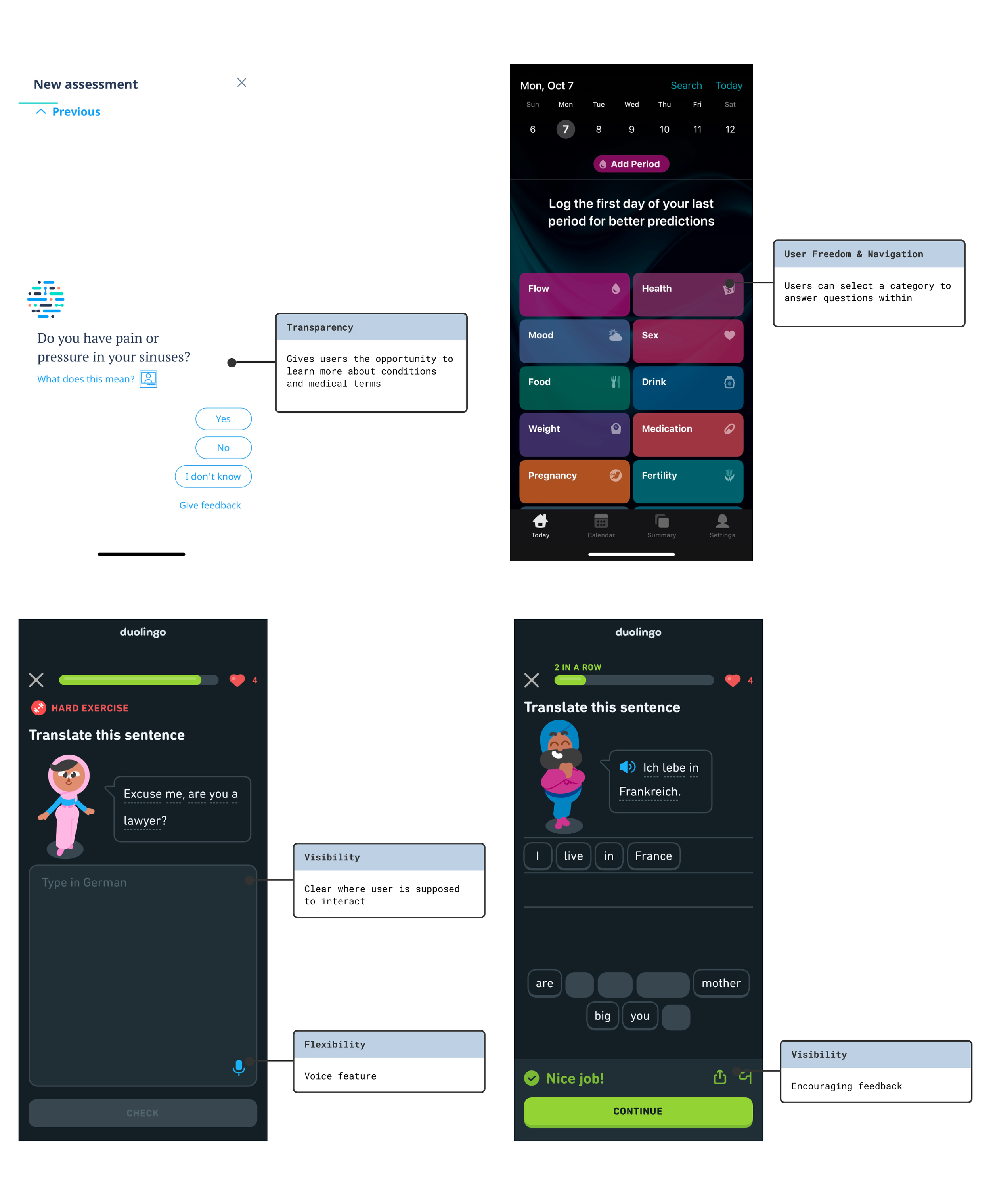
We hypothesized that rephrasing the questions could give care providers more valuable answers. In examining competitors' approaches to surveys, we identified two key factors that LiteraSeed missed:
User control and freedom – The option for users to choose the order in which they answer questions.
Free-form questions – Providing space for users to describe their feelings in their own words.
Enhancing User Engagement
In our quest to enhance the product’s engagement, we examined Duolingo. This app shares two critical areas of overlap with our product: providing an engaging user experience and addressing foreign language use. We were particularly impressed with the interactive features that Duolingo employs.
Language vs Culture
In our research, we recognized that culture encompasses a shared set of values, traditions, food, art, and social practices passed down through generations. Language serves as the vehicle for expressing these cultural elements. However, as cultures evolve, language sometimes lags behind.
This raises an intriguing UX challenge: Can we expect a native speaker, deeply ingrained in their cultural backdrop, to communicate in the same way as someone who has learned the language in a different context or time period?
To address this challenge, we evaluated Skype Translator and Google Translate, but found that both tools lacked the capability to capture cultural nuances effectively. After consulting with our software engineering team, we determined that implementing a voice-to-text feature was not feasible at this time.
Scaleability
For this project, our primary focus was on the OB/GYN survey intended for pregnant individuals. However, our goal extended beyond this single application; we aimed to equip the client with a versatile design toolkit for future surveys. This toolkit would include recommendations for color palettes, font styles, iconography, and standard layouts tailored for mobile devices.
Addressing Low-Literate Users
While we had successfully tackled many aspects of the problem, addressing the needs of low-literate users remained a challenge. During our research, our client, Aziza, pointed us to a comprehensive repository of studies she had accumulated over several years. Among these, she recommended a particularly relevant paper titled “Designing Mobile Interfaces for Novice and Low-Literacy Users.”
The paper detailed usability tests conducted on a banking app designed for low-literate users and provided the following key design recommendations:
Offer local language support, both in text and audio.
Simplify hierarchical structures.
Eliminate the need for non-numeric text input.
Avoid scroll-dependent menus.
It was noteworthy that our competitive and comparative analysis (C&C) of various apps confirmed the efficacy of these guidelines, as many of the apps we examined adhered to most, if not all, of these recommendations. This insight reinforced the importance of incorporating these principles into our design process to enhance accessibility for low-literate users.
Shaules, J. (2019). Language, Culture, and the Embodied Mind. Springer Singapore, p. 123. Retrieved from doi:10.1007/978-981-15-0587-410.1007/978-981-15-0587-4
This diagram shows a mobile banking app layout. First, the user enters their PIN. Then, they choose from three options: check balance, withdraw money, or send money. After this, they only need to answer “yes” or “no,” enter numbers, or confirm actions.
Medhi, Indrani; Patnaik, Somani; Brunskill, Emma; Gautama, S.N. Nagasena; Thies, William; Toyama, Kentaro . (2011). Designing mobile interfaces for novice and low-literacy users. ACM Transactions on Computer-Human Interaction, 18(1), 1–28. doi:10.1145/1959022.1959024
Brainstorming
Design Studio
With our research phase complete, we transitioned to brainstorming ideas. Our team collaborated closely with key stakeholders, including the two co-founders and their engineer. To ensure accessibility and encourage creativity, everyone used pen and paper for the ideation process.
In a particularly memorable moment, one of the co-founders sketched their design ideas on a paper bag, illustrating the collaborative and inclusive atmosphere of our sessions.
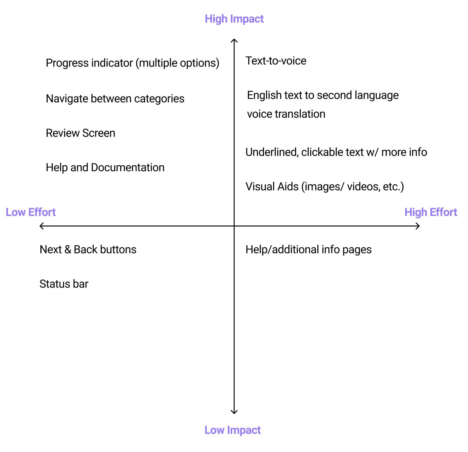
Feature Prioritization
We gathered the concepts generated during the design studio and refined them further. Then, we met with the software engineer for a feasibility assessment. Considering the time constraints, available technology, and human resources, we streamlined the features accordingly.
Structural Changes
Current User Flow:
Forcing Users Down One Path
The client's survey was designed for users to answer categories in a specific, arbitrary order, resulting in a rigid, linear experience.
Proposed User Flows:
Giving Users More Control
Allowing users to choose which survey categories to answer first can help them feel more comfortable sharing information.
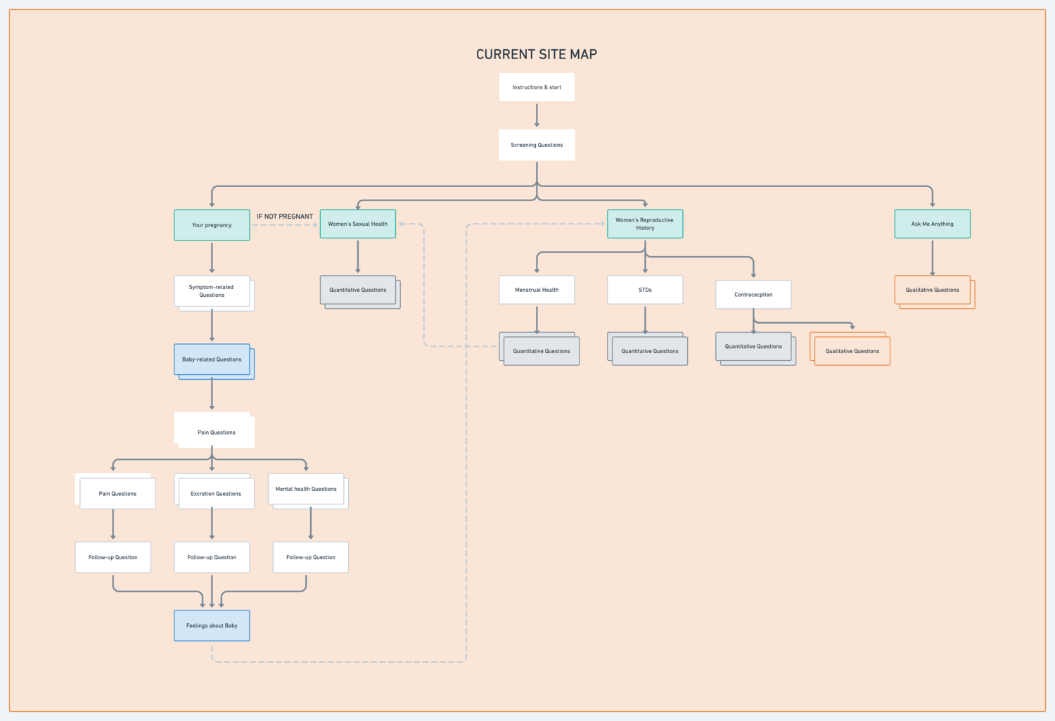
Current Site Map:
Unorganized & Confusing
While the site map had some level of hierarchy, some users found certain grouping of content confusing
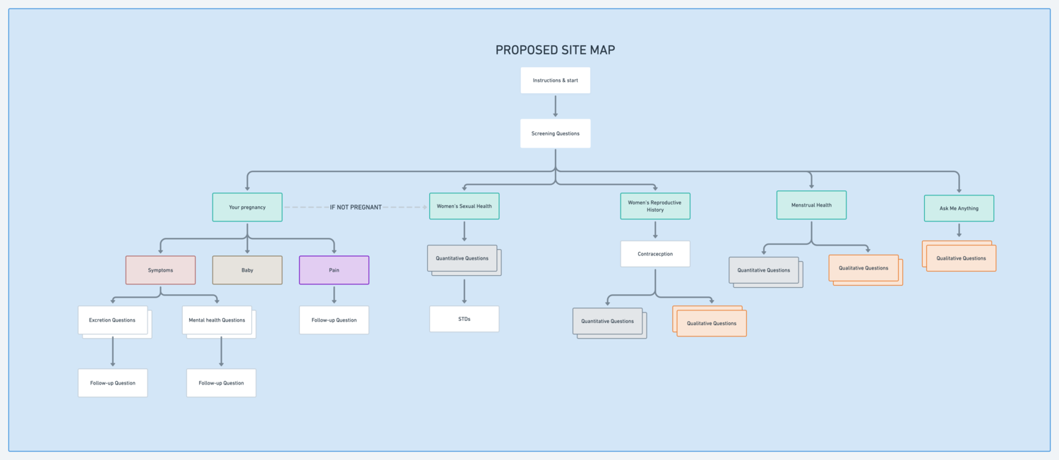
Proposed Site Map:
Reorganizing Questions
Within Categories
Creating categories that grouped similar content together helped to give a more logical experience for the user
Additional Features
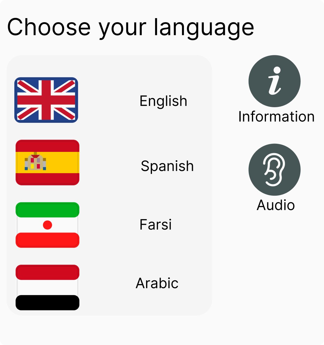
Language Selection Menu
To accommodate diverse communication preferences, I designed a menu for patients to choose their preferred language. Our team debated the use of flags to denote languages, considering the potential for misunderstandings and cultural sensitivity. Ultimately, we decided to proceed with flags alongside text labels for several reasons:
Universal Recognition: Flags are quickly recognizable symbols that often allow users to identify their preferred language with a single glance.
Cultural Associations: While flags are not perfect, they often hold cultural significance that can help users feel more at ease. However, we paired flags with text labels to reduce ambiguity.
Accessibility Options: In addition to visual indicators, we provided an audio option to accommodate users with different literacy levels or visual impairments, enhancing overall accessibility.
Regarding the choice of the Union Jack to represent English, we selected it over the US flag for two key reasons:
Global Representation: The Union Jack represents the origin of the English language and is widely recognized internationally. Our decision aimed to appeal to a broader audience and avoid biases towards any particular variant of English.
Cultural Neutrality: Using the Union Jack can reduce potential cultural biases as it represents the language rather than a specific country's influence on it.
By combining flags, text labels, and audio options, we aimed to create a user-friendly and inclusive experience for all patients, ensuring they can easily access information in their preferred language.
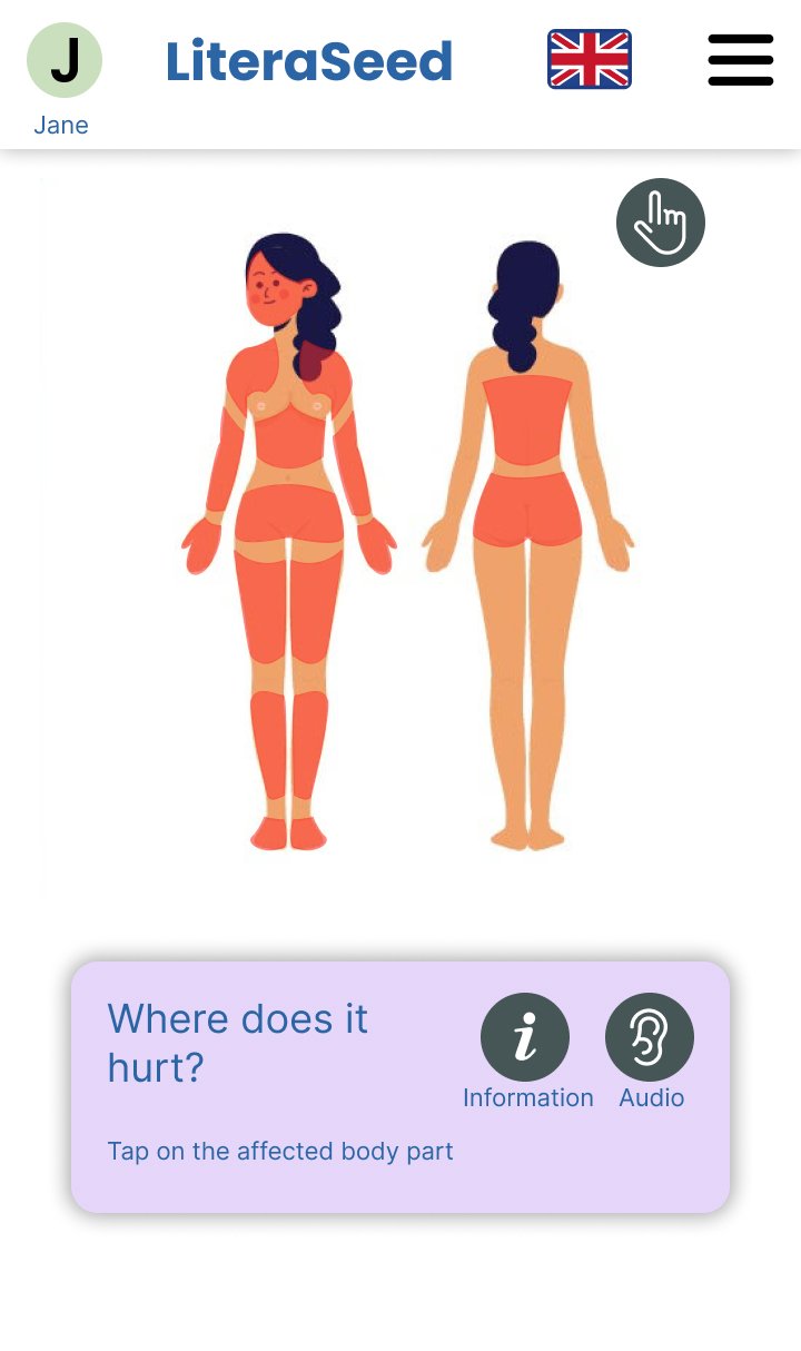
Where Does It Hurt?
During our design studio, one of the ideas that emerged was an interactive visual tool to help patients more accurately communicate areas of pain.
Utilizing vector tools, I designed an interface featuring a segmented human body. Users can select specific body parts, which are then highlighted, enabling a clearer and more precise description of their discomfort. This interactive approach was aimed at enhancing the accuracy of patient communication and improving overall user experience.
The Final Result
Final Prototype
The scenario:
-You are 6 months pregnant and have an appointment with your OB/GYN
-You would like to report the shoulder pain you’ve been experiencing to your doctor
Conclusion
What’s Next?
Looking to the Future
-Language detection
-Voice dictation
-Multiple languages translator

